Gallery Etiquette
Hi everyone, I hope you enjoyed the CSULB School of Art, Gallery Complex, experience on Thursday. One important thing to mention is how to behave in an Art Gallery or Art Museum. Galleries and Museums or “Cultural Institutions” have some things in common with Libraries, but also some things different. In a Library you’re supposed to be quiet. And touching the books (most of them) is encouraged. It’s the opposite in a Gallery or Museum. You don’t have to be quiet. You can talk, you can laugh, you can interact with your friends and the work.
Don’t Touch
But in most Galleries & Museums most of the time, You NEVER TOUCH the work! It might be a 500 year old masterpiece from Florence painted by one of the geniuses of the ages, and it might be a 5 day old painting from a CSULB student, but either way, it’s tremendously important NOT TO TOUCH the work! Don’t touch it with your hands. Don’t bump into it. Art is a human legacy. Sometimes it’s priceless to our entire culture. But all art is priceless to someone. And with so many people moving through these spaces, we can really damage work in the process of appreciating it. So please by very, very careful. VERY!!
Backpacks
Backpacks are kind of a problem for us. Most galleries and museums won’t allow them in their galleries, you have to check them at reception. However we have an additional problem at CSULB, which is a lot of theft. For sure you should never leave your stuff unattended. An unwatched laptop can literally be gone in 60 seconds. So we have to try to balance the Backpacks don’t belong in the galleries problem with the I don’t want my stuff ripped off problem. If you have a chance to leave a backpack in a locker or dorm on Thursdays, that might be cool. Just bring your mobile or laptop or whatever you need. If you do need your backpack, that’s understandable. But then be EXTRA CAREFUL in the galleries. If you’re taking a photo for somebody, remember a backpack can extend you way back and if you’re backing up to snap the photo you can walk right into a painting, video monitor, sculpture, or other fragile piece of work.
Contacting GLAMFA Artists
Week 2 will be the same plan as last week. We’ll look at the GLAMFA exhibition in the SOA Galleries, have a conversation with a classmate, and write up another work from the show, letting the GLAMFA Website and the Artist’s Website as stand-ins for conversations with the artists. Next week, Week 3, we’ll be on the “normal” track for the rest of the semester with 4-5 different shows each week and the artists will usually be inside or at a table outside the gallery.
The Organizer of the GLAMFA Exhibition, CSULB Grad Student Dawn Ertl has also offered to put you in email contact with any of the artists if you’d like to ask them some questions. You can email the artist’s name and your questions for them to Dawn, and she will forward them to the artist for you. This is optional. You don’t have to do it. If you would like to ask any artist questions, you can email Dawn at: [email protected]
Questions
I received a lot of questions over the weekend for things that were in the syllabus. I don’t really mind, after all, enrollment in Art110 comes with “unlimited questions,” and I’m sure sometimes the syllabus needs a little explaining, but just FYI, you can find a lot there. I’ve expanded the Syllabus Table of Contents to help make more info more easily available:
Syllabus TOC
Subsections of Special Interest
- 2a. What’s Due?
- 2b. Late Policy
- 2c. Attendance
- 3a. Extra Credit
- 3b. Rubrics
- 3c. Artist Tags
This Week
This week we’re doing some Photography. Later in the semester we’ll do a little bit more traditional photography where we try to compose a photograph and think about its aesthetics. This week we are taking pictures, and we’ll no doubt have aesthetic considerations, but the focus of our experience is to use our Mobile Cameras as tools to explore and express social relations.
Our Relational Aesthetics Activity will use Instagram. Most of you already have IG accounts. If you don’t, you can just make one for the day. If you don’t have a smartphone, you can work with someone, or you can use my iPad during class on Thursday. Thursday, Sept 4 is our “Instagram Day.” From when you wake up in the morning till you go to sleep that night, take at least 4 IGs. Or more if you like.
Full details on the Instagram page
NOTE:
Even though we’re Instagramming on Thursday, you still have to do a POST on your website by Sunday night. TO GET CREDIT FOR THE IG ACTIVITY, YOU MUST DO AN ANALYSIS POST ON YOUR WEBSITE! Details on the Instagram page
Your Websites (last week)
You all did great work last week getting your websites launched! Did you realize you could have your own website with the design and content of your choice that fast? In Week 8 we’re going to focus more specifically on making Your Passion be the focus of Your Website. I’ll show you how you can easily put your Art110 work off to the side, and let your website feature your Fashion Merchandising, Dance, Nursing, Business Marketing, Recreation Therapy, Hospitality Management, or any other career focus. Of course, you don’t have to wait till then. You can use your website for anything you want right now. Want to write about Health & Lifestyle? Or Politics? Or Student Life? Just click New Post and start typing on your keyboard or talking into your mobile.
Designing a “You” Website
In school we spend a lot of “head down” time just focusing on requirements, like “what’s due this week?” That’s legit. But in the long run, I believe a compelling ePortfolio will serve you far better than just an “I turned in my homework” website. Sooner than you think you’ll be wanting things like internships and later jobs and careers. Why not start making a place where anyone who wants to know about you can find the work that you’d like to show?
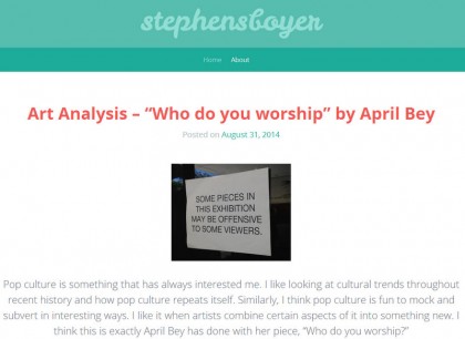
Here’s Stephen Boyer’s website. Just like so many of you Stephen did a great job in Week 1. He got his site up and wrote 2 nice pieces on a Classmate and a GLAMFA Artist. He even bought Stephen S Boyer.com – Awesome!
I’m totally not dissing Stephen or any of you here – gosh, we’re just getting started! – but nice a job as he did with Week 1, what his website doesn’t show me, is what he really cares about, and how strong his work is. Lucky for me, Stephen found me on Twitter last week and that led me over to his Vimeo Channel. Wow. Stephen’s only an incoming freshman, but he’s already done so much remarkable work. Here’s one, a short film called Paradigm:
For a filmmaker like Stephen, an analysis of April Bey’s artwork is great, but a film like Paradigm is really his raison d’être. I hope before this semester is over Stephen has a website that shows his work, talks about his ideas, and chronicles what he’s working on now.
I hope that’s true for all of you.
Others of you also have strong work to show. Some of you might think, well, I don’t really have anything great yet. Or perhaps you think, I’ve done some nice work, but it’s not really visual, like Stephen’s short film is.
Your Best Face Forward
You can find a way to put anything on your website! Words. Images. Graphics. Charts. Audio. Video. The website for a future CIA agent is going to look pretty different from the website for a future Tattoo Artist, but anyone can show their work. And if you don’t think you have much yet, I’d encourage you to put up anything you have. The great thing about the web is how easy it is to revise things or replace them with new, better work.
You Are Creative
Remember that “creativity” is everywhere. It’s easy to look at a film like Stephen’s or a painting or a performance and say, wow, they’re so talented! But what about the Accountant who creatively rearranges a spreadsheet in a way that no one ever has before and discovers how you’re losing a lot of money or ways you could be making a lot more? That’s “creativity”! And it really matters! Looking from lots of angles. Thinking differently.
The Medici Family from Renaissance Florence are easily the greatest art patrons the world has ever known. One family was so influential in fueling and shaping The Renaissance and sponsoring artists like Michelangelo, Leonardo, Botticelli, and many others. But the way the Medici Family rose to power is that they were bankers and they were early inventors of double-entry accounting. You can be “creative” in any field!
More of Your Work
Here’s a few more of your websites from last week.
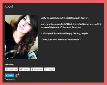
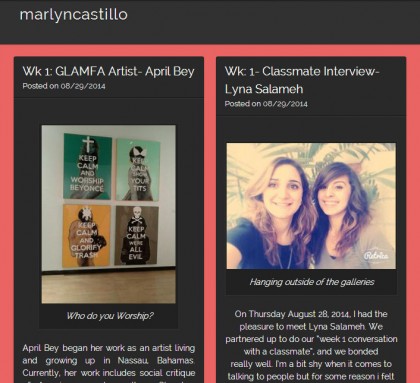
Here’s Marlyn Castillo’s website. Looks great. Nice posts. I love her choice of the “Visual” theme. Traditional “blog” themes have one post rolling down the homepage. That’s pretty good. But what if I’m not so interested in that one thing? Marlyn’s theme puts a lot of content, a lot of choice right up front on her home page. It’s a great way to feature a lot of the stories you have to tell. It’s also a great way to show off your work in an ePortfolio.
Marlyn also did something small but powerful that many of you haven’t gotten around to yet – but you can at any time! She made an “About” page. That’s a great place to say who you are, what’s up, and perhaps include some contact info.
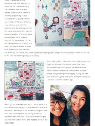
Diana Martinez / DC Martinez.com
Diana Martinez shows what us what a conversation is all about! Be sure to drop by Diana’s website and read about her “Conversation” with Joy Floresca. It’s wonderful work. It’s the kind of connection we should all try to make more of.
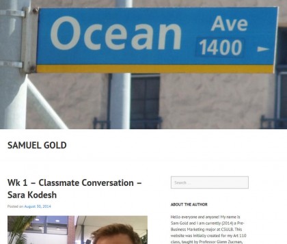
Great site by Samuel Gold. You can really feel his presence. And BAM, there’s his “About” right on the home page. He’s not making the visitor do too much work, he’s got where you are, and who I am, right there.
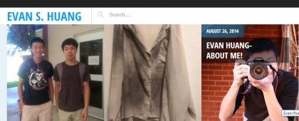
Check out the interactive rollover effects on Evan Huang’s home page. We all know that we’re engaged when our online actions feel alive and interactive, and Evan’s homepage gives us exactly that. His “Pictorico” theme is a really nice way to design your site and present your work.



What do we hashtag our pictures ?
Hi, if you mean the Instagram Day pix, it’s
#art110f14
If you mean the Conversations with Artists, there’s a different tag for each artist on the Gallery page:
https://beacharts.ca/fall14-galleries/
thank you